The manners we interact with an electrical device besides a touchscreen
- Deloon

- Aug 17, 2021
- 2 min read
“User Interface” is one of the major essences in product design, the objects enabling communication between a user and the device. There are many types of control interfaces that sometimes we are stuck to choosing, or just reusing the familiar ones, which is so pity.
In this article, we are going to share the interface examples besides a touchscreen that we’ve collected.


Buttons are the most common interface type we could find on various devices. It takes a clear and intuitive interaction and also applies in a wide range. The first tip of button design is to put it organized, it's the most normal treatment for function keys.

We could arrange all the buttons on an elastic part on some special function or appearance application (e.g. waterproof).

If there's one simple button/function rim leading the major function, we could take it as the emphasized center, which is also the eye-catching point on the product.


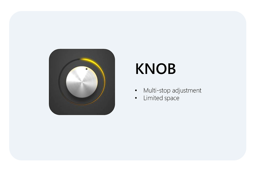
Knobs could have a multi-stop and slight adjustment within an effective space.
We also could put some buttons or related/significant feature parts in the circle center.
Furthermore, by changing the rotational axis direction we could have the other type of knob, i.e. scrolling wheel, that has a different application and stocks more volume inside the device.


Toggle and slide, also are capable to implement multi-stop in a different way.
It's also vision recognizable that the users could easily receive the switch status.

In multi-direction toggling, it could combine with software functions that the user could have a more intuitive and multiple applications. However, a touchscreen also instead has a similar feature.

There is no doubt that touchscreens have become the mainstream of the product user interface, but the traditional interface still has its irreplaceable value. hopefully next time we could still have a more flexible option while designing the interface portion.
(The device example picture source: https://www.pinterest.com/deloongao/interface/ )


Comments